It was quite common in Game Boy games to see somewhat eccentric fonts, many of them with excessive pixels
intended to achieve a more composed letter, resembling print and almost always limited to uppercase only.
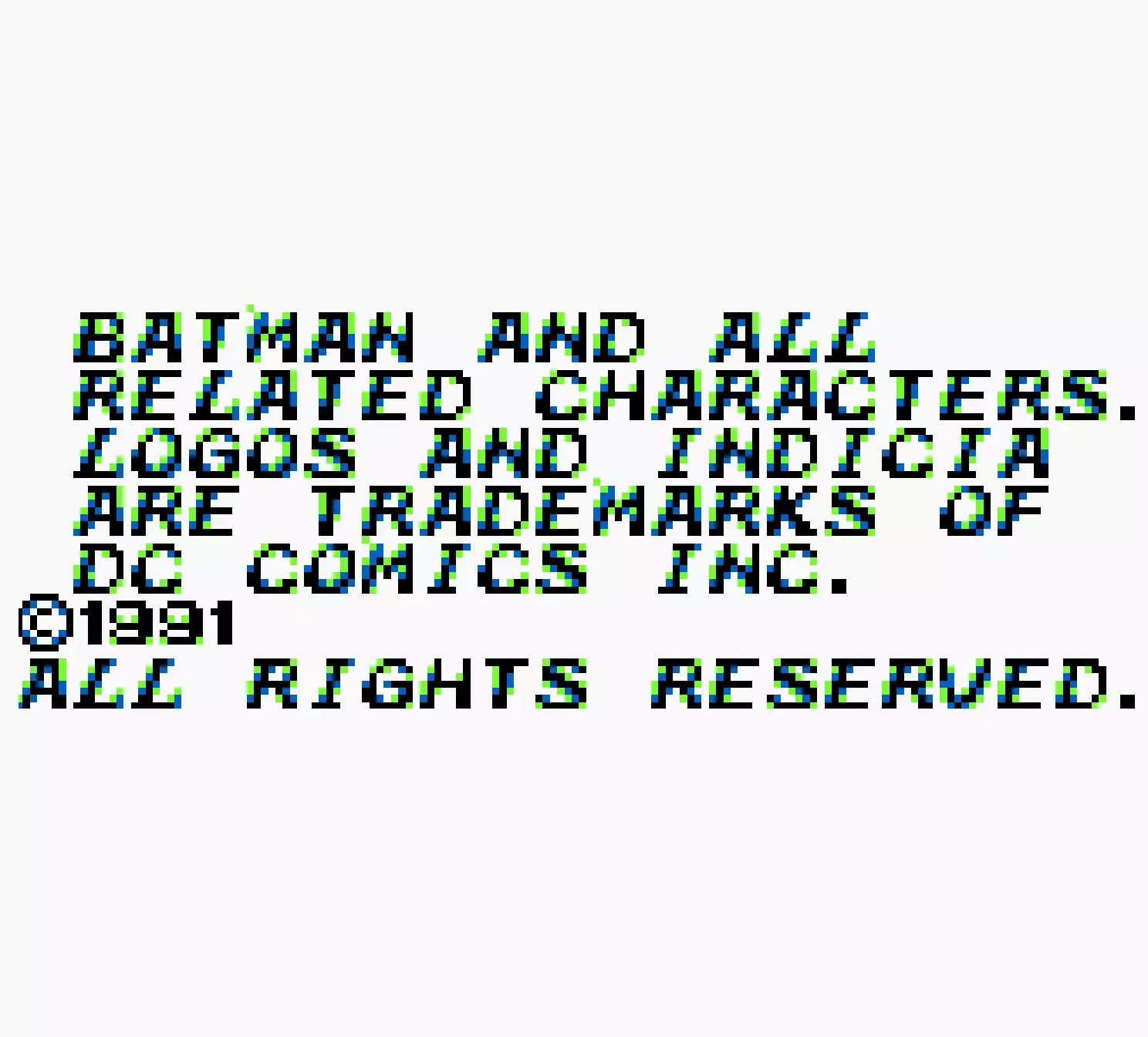 Batman: Return of the Joker 1991 GB, by Sunssoft
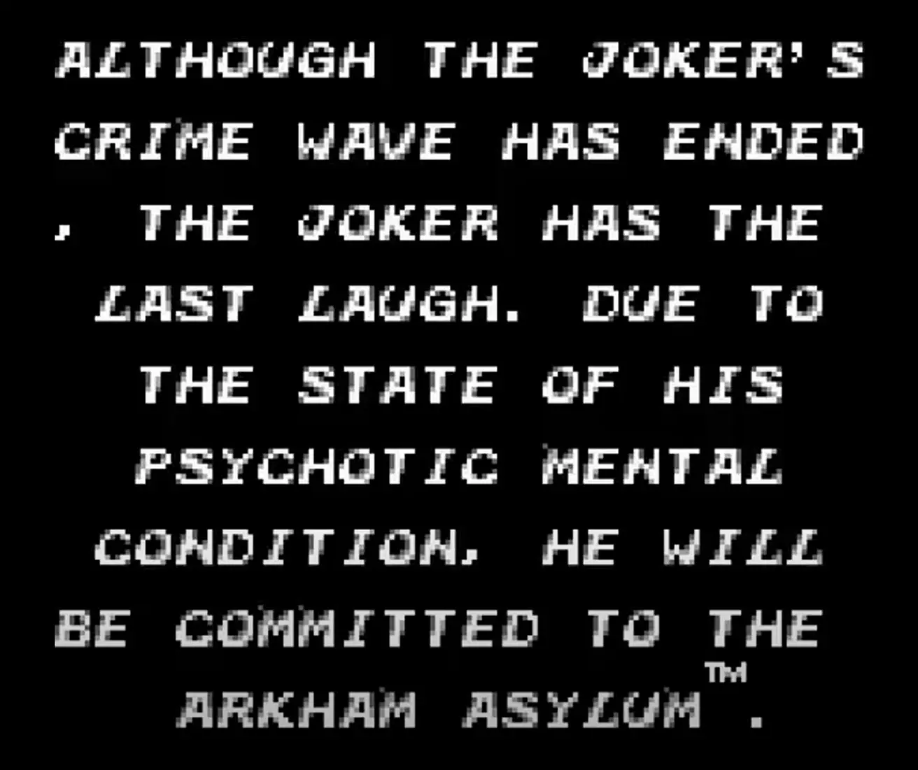 Batman: Return of the Joker 1991 GB, by Sunssoft
Another very weak point of the Game Boy fonts was the kerning and line height. I never came to understand
the reason for such aberrant separations between letters and words, knowing the little screen space they
had available.
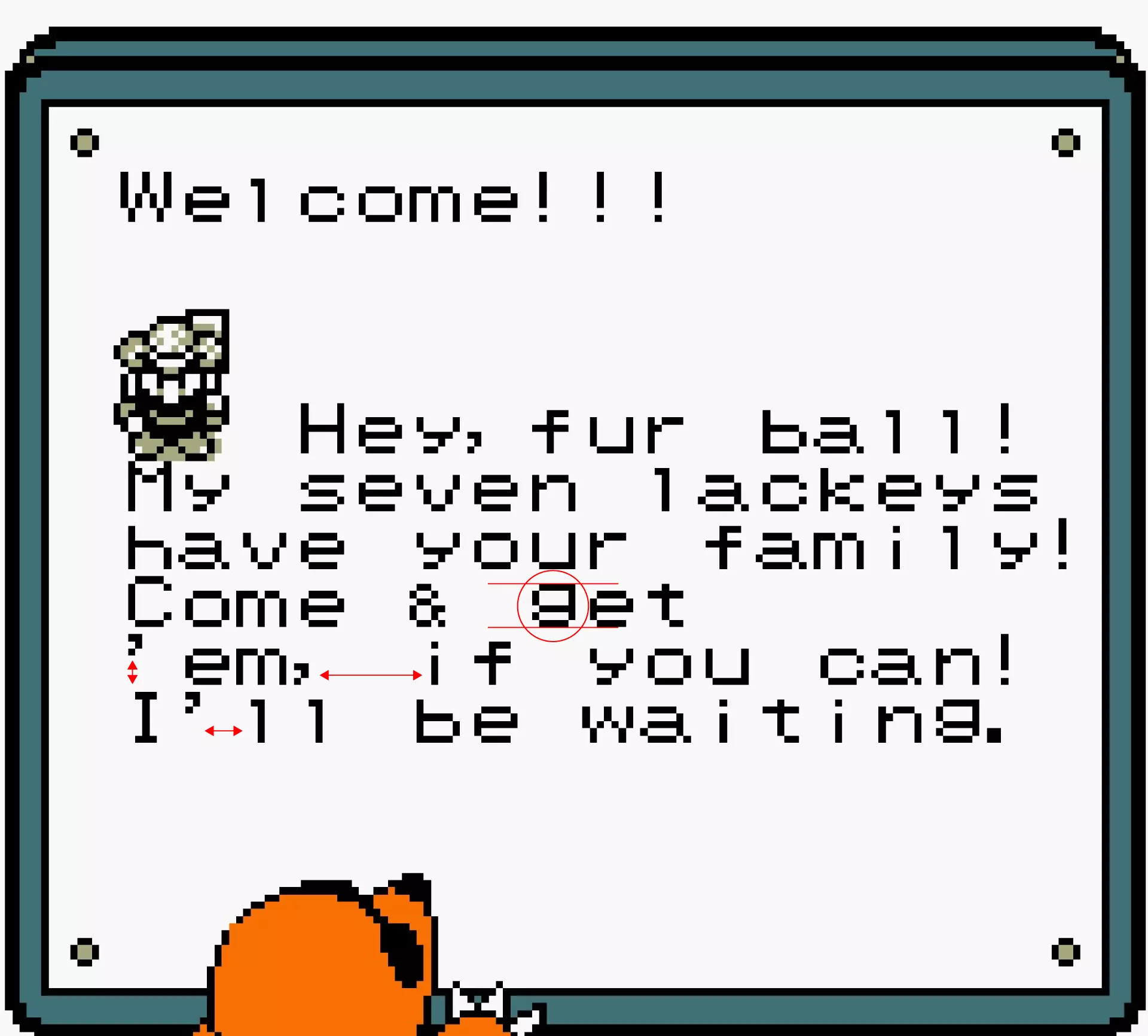 Mole mania 1985 GB, by Shigeru Miyamoto
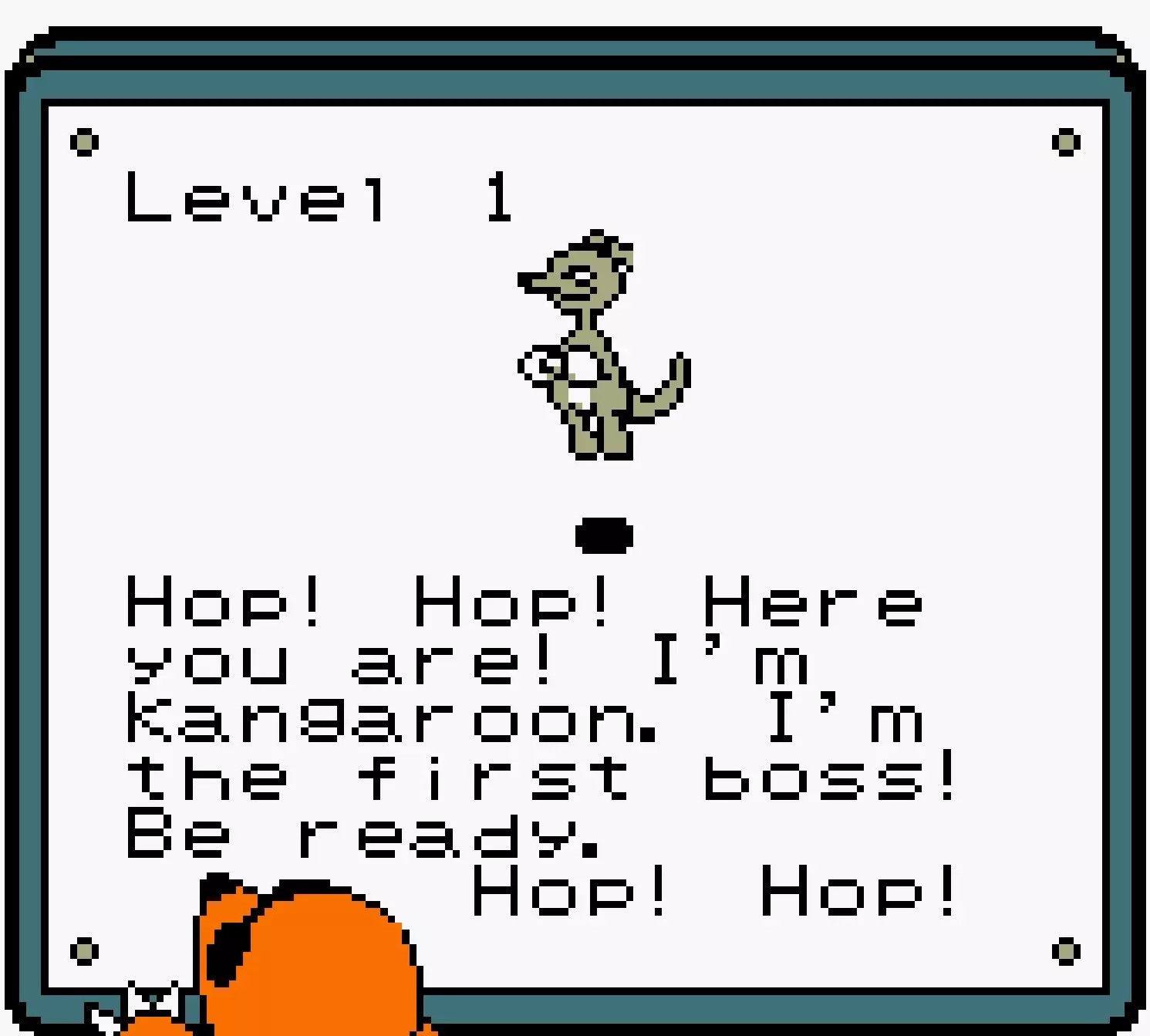 Mole mania First boss.
I suppose all these observations made me not pay attention to them beyond their quick and intuitive
reading.
That's when I decided to prepare a grid and design my own typography pixel by pixel, using pixelated
fonts from other Game Boy games of the time as a reference.
 Batman: Return of the Joker 1991 GB, by Sunssoft
 Batman: Return of the Joker 1991 GB, by Sunssoft
 Mole mania 1985 GB, by Shigeru Miyamoto
 Mole mania First boss.